A006 - Color Chords
Color Chords
Colors interact with each other when they are placed together. The interaction can be pleasing sometimes, ambiguous and puzzling other times. While we have dozens of systems to denote individual colors, we do not yet seem to have a system to specify a set of colors that could yield a specific interaction. We hear analogous combinations, complementary combinations, triadic combinations and so on, but they are not specific enough to generate individual colors. Musical chords, on the other hand, consist of specific notes and can be played by different players with different instruments, yielding the same or similar sensation of sound.
Maybe, paintings have never been intended to be composed by an artist and then played later by other artists. However, it became my problem to solve because I typically do not reduce what is in front of my eyes into my paintings, but I come up with an idea first and translate the idea into paintings using colors and shapes. The idea is not at the level of individual colors, but at the level of tension dynamics created by interaction of colors and shapes. I had to have a way to experiment with those tension dynamics by generating individual colors over and over again until I am satisfied. For the experimentation, I needed a method to specify a set of colors with a certain color interaction. I call this method “color chord”.
The color chord specification should be simple, intuitive and unambiguous to specify a set of colors so that we can easily communicate and generate the same set of colors when we want. Listing all colors within the set would be too hairy to communicate. “Red with similar colors” would be too ambiguous. The color chord specification should also be comprehensive enough to cover frequently used harmonic interactions such as complementary and analogous. My approach to achieve the two seemingly conflicting goals at the same time was to investigate how we first and foremost experience aesthetic pleasure in color combinations.
There are thousands of studies on color harmony. However, they are just examples and heuristic rules with little reasoning behind that I can refer to. Aside from our culturally and environmentally distorted color experiences, I believe that our pure aesthetic experience is the direct result of human biology that has been shaped by evolution. I observe two biological principles that are related to our color experiences. The first principle is simplicity. Our brain prefers a simpler way to recognize anything. It gets a positive aesthetic experience when it finds a path to simplify. This is how harmony in musical chords has been established; one note sets a particular path in our brain and the following note meets the expectation of the path by a simple proportion of the previous frequency. Similarly, one color creates a particular color expectation and our brain gets pleased when it sees another color that meets the expectation by simple transition. Simplicity is coming from the fact that our brain relentlessly pursues an economic way of processing information (i.e., doing more with less effort). The second principle is that a color creates a particular tension in our visual sensory unless it is a neutral gray. The sensor then actively seeks for another color that can neutralize or reduce the tension created by the first color. This tendency is very unique to our visual perception. It actually substantially distorts our color perception. Orange is perceived redder when it is located next to green because the tension created by green could be reduced by red. This phenomenon has been demonstrated in numerous paintings by Josef Albers. When the tension gets neutralized, we experience aesthetic pleasure as a reward.
I define color chords over the Munsell Color System. It creates a color sphere with hue as circle, value as height, and chroma as distance from the axis. The system is based on perceptive colors as in color pigments rather than color of light, which is an essential property for color notation for paintings. What is also amazing is that the perceptive distance and the geometric distance between colors in the sphere are the same. This has been validated through extensive experimentations. This means that a color located along the geometric path from Color-A to Color-B is actually a mixture of Color-A and Color-B, perceptively. Mixing the same amount of Color-A and Color-B would yield the color at the center of the path. Mixing twice the amount of Color-A to Color-B would yield the color at 1/3 position of the path. This property enables us to generate the right colors along the transition path from one color to another. In other words, using the colors in the geometric path in the sphere allows us to transition our color perception from one color to another.
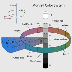
(Source: https://en.wikipedia.org/wiki/Munsell_color_system)
Now, I am ready to define my color chord specification. A color chord, <Color-A, Color-B, var-X> denotes a set of colors located within the distance X from the geometric path from Color-A to Color-B in the Munsell color sphere. Basically, Color-A and Color-B determine the perceptive transition of colors, and X allows an optional variance from the transition. If Color-A and Color-B are the same, the path becomes just a point, and simply denoted as <Color-A, var-X>. Colors from <Color-A, var-X> with relatively a small X are perceived by our brain as analogous without transition. Colors from <Color-A, Color-B, var-X> create a tension by Color-A, and transition to Color-B, or vice versa. Color-B could neutralize the tension created by Color-A if Color-B is located opposite side of Color-A in the hue circle. The tension can be cascaded with multiple color chords and then neutralized altogether. For instance, if Color-A, Color-B, Color-C are located at the same angle distance in the hue circle, cascading <Color-A, Color-B, var-1>, <Color-B, Color-C, var-1>, and <Color-C, Color-A, var-1> would achieve creating a tension, transition to another tension, followed by neutralization, which is a triadic harmony.
I found that this notation of color chords is very simple to create a new chord, yet so powerful that I could define any color tension in practice. It is also very straightforward to generate colors of a chord programmatically, thanks to the Munsell color sphere. I actually wrote a computer program, Ordered Random Studio (ORStudio) to experiment color tension using the color chords. The following are a few illustrations of color chords being applied to an image.
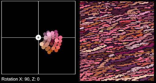
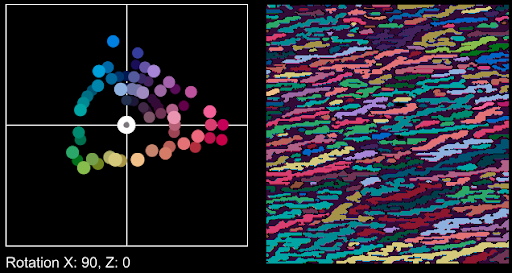
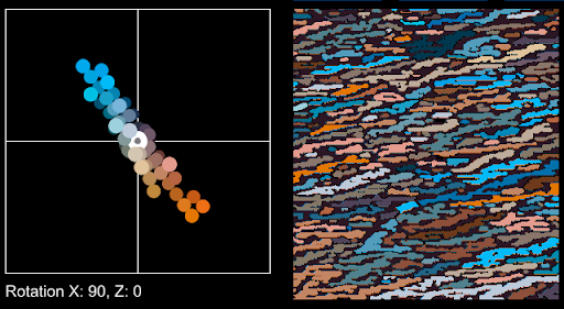
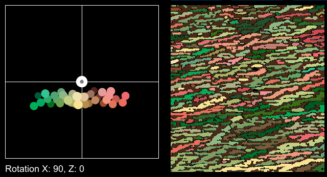
There are also several series of paintings practicing color chords. They are found in the “Paintings” page of my website. A few notes are due:
- A color chord itself is not harmonic. It was created to specify a variety of color tensions, some of which could be harmonic, of course.
- The color notation in my color chord is from the Munsell color notation, except that I use the 0-20 gray scale rather than the original 0-10 scale. This is my artistic choice that I feel the perceptive discrimination in value (lightness) is significantly greater than that in hue and chroma.
- My specification only concerns hue and chroma. All shades and tints of the color are automatically included in the chord. This is another artistic choice of mine in that I do not think the lightness alone alters the kind of color tension, or at least not as much as hue and chroma. Note that lightness does affect chroma, which is already taken into account in the specification.
July 2024
Pyungchul Kim